PRODUCT DESIGN - DESIGN DIRECTION
ABOUT THE PROJECT
RECURRENTE IT'S A PAYMENT APP FOR LOCAL SHOPS AND EVENTS FROM CENTRAL AMERICA.
The Company Vision is to have a World Class Experience for more than 500~ active users, giving them Fresh New Air, Security, and the easiest way to get their payments.
ROLE
Product Designer, Art Direction
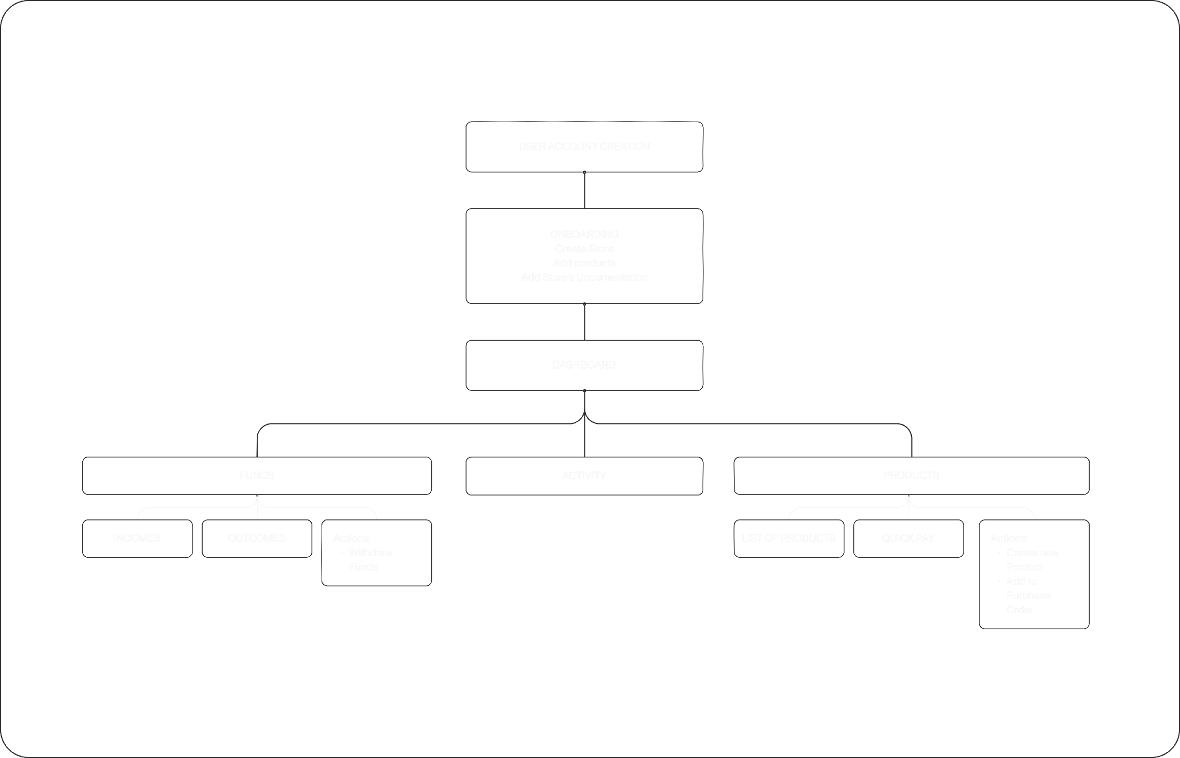
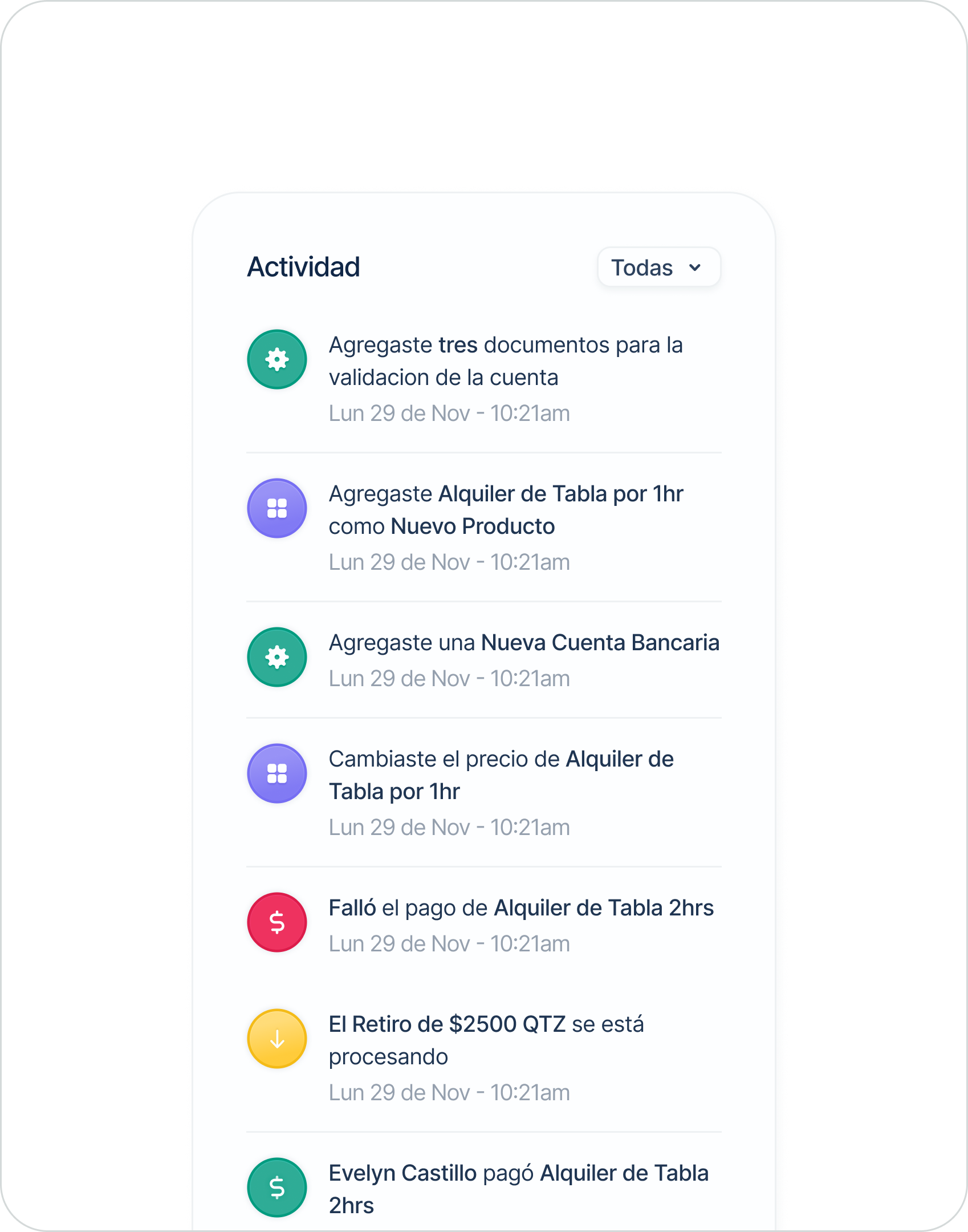
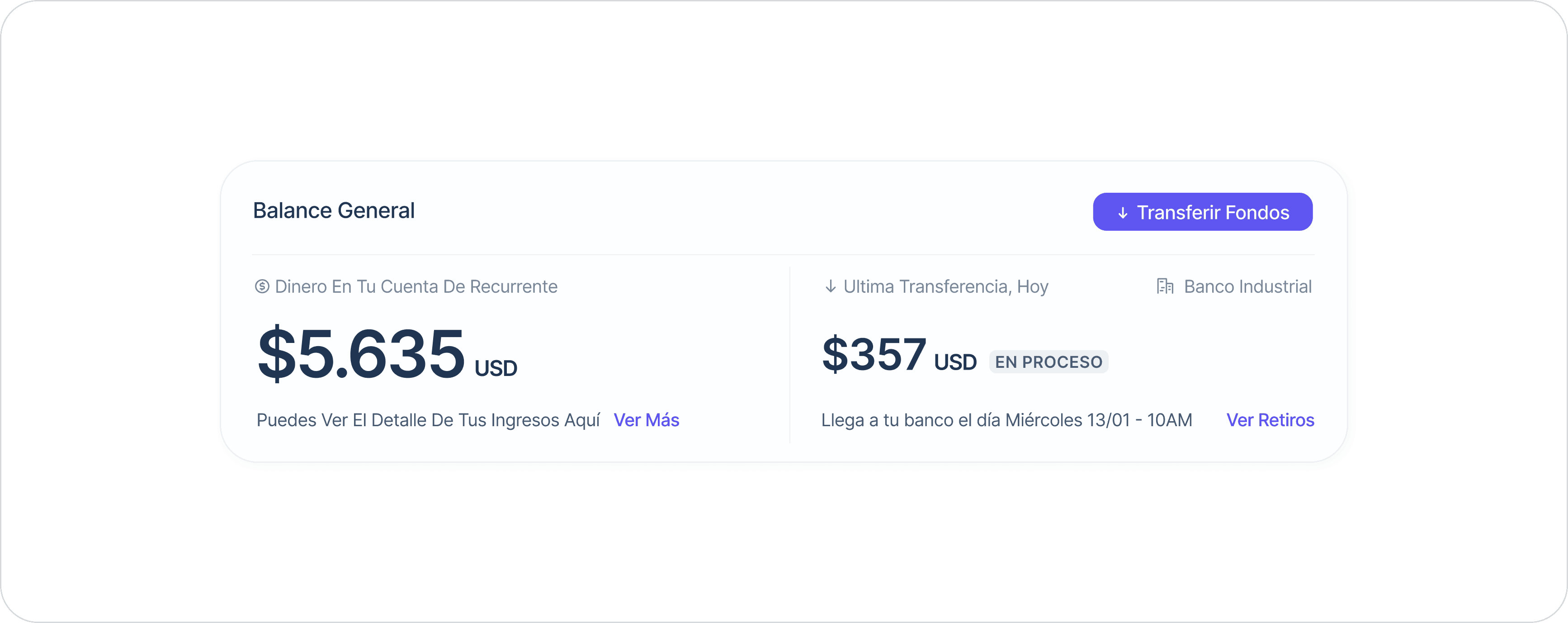
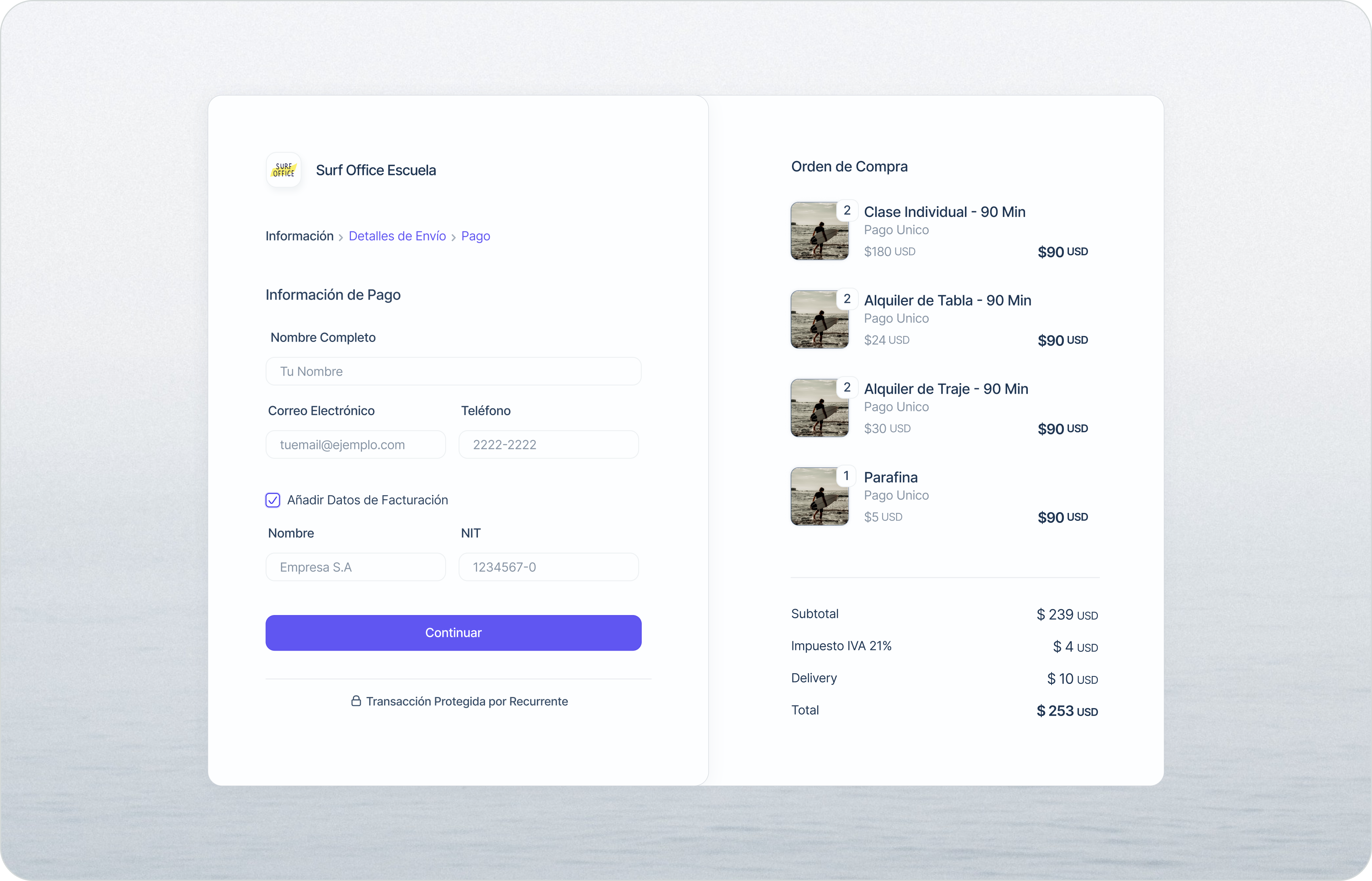
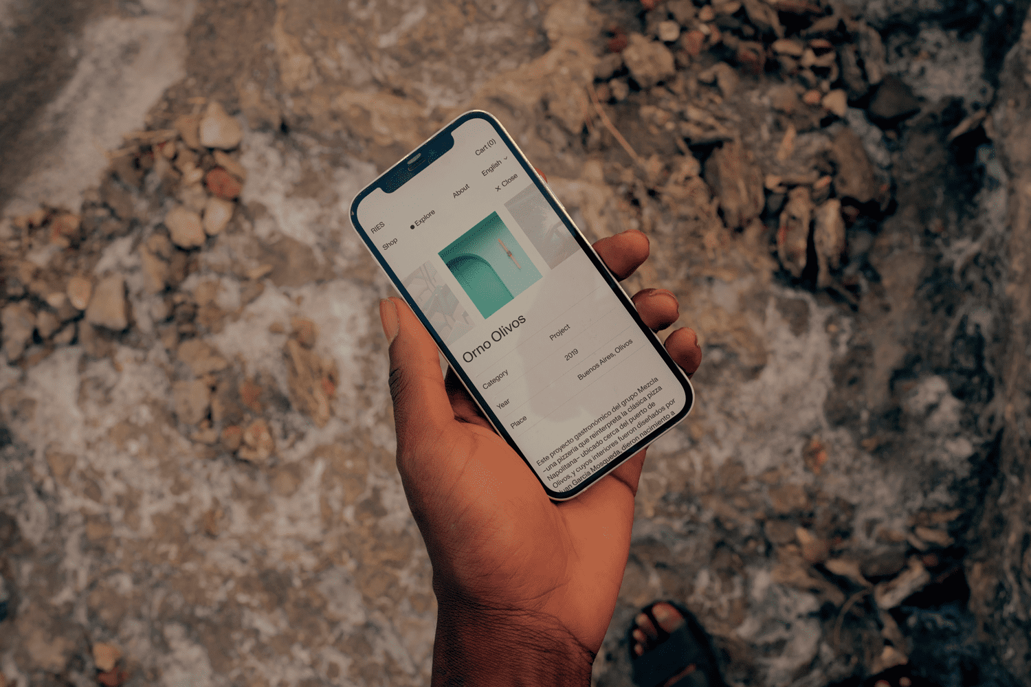
INFORMATION ARCHITECTURE
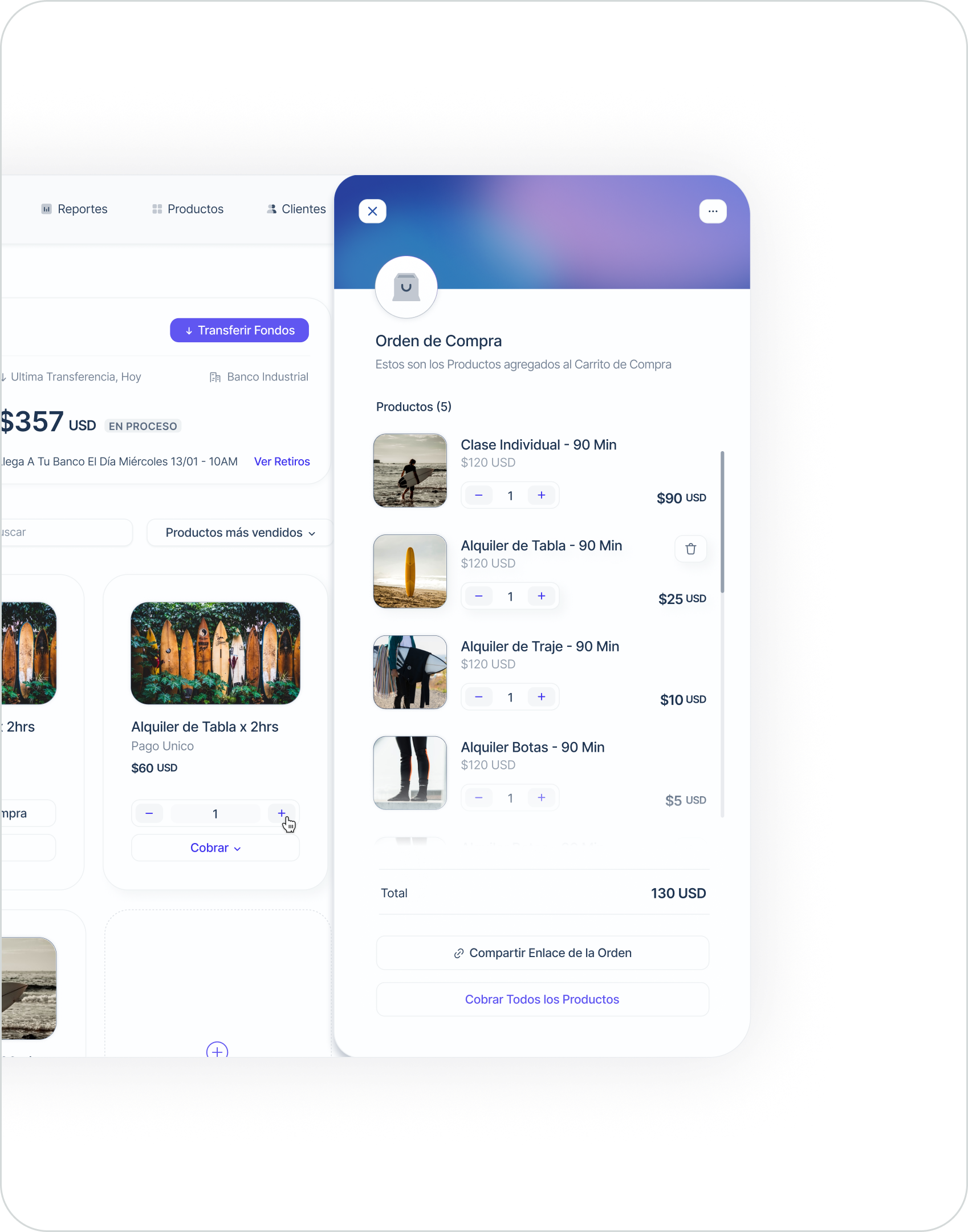
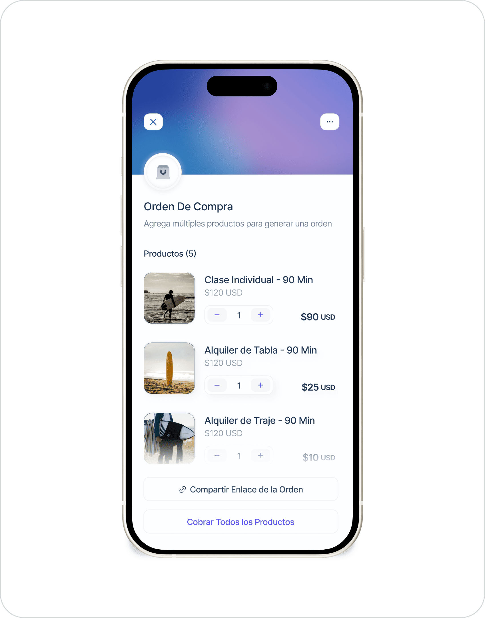
The first version of the product was done on the go, so there was a problem with the content hierarchy. The information was presented with just two levels of depth, which unintentionally downplayed the importance of certain details. This happened because new features were added while it was created, trying to highlight them but putting it all at the same level. As a result, everything seemed to have equal importance, leading to a cluttered front page filled with a wide range of features and information.
To address this, a potential solution was to organize the features and information into logical groups and then add varying levels of depth within each group. This approach aligns with how users naturally think and understand things, making the information more intuitive, predictable, and in line with their expectations. By providing a clear hierarchy, users would feel more at ease, confident, and empowered when using the product.
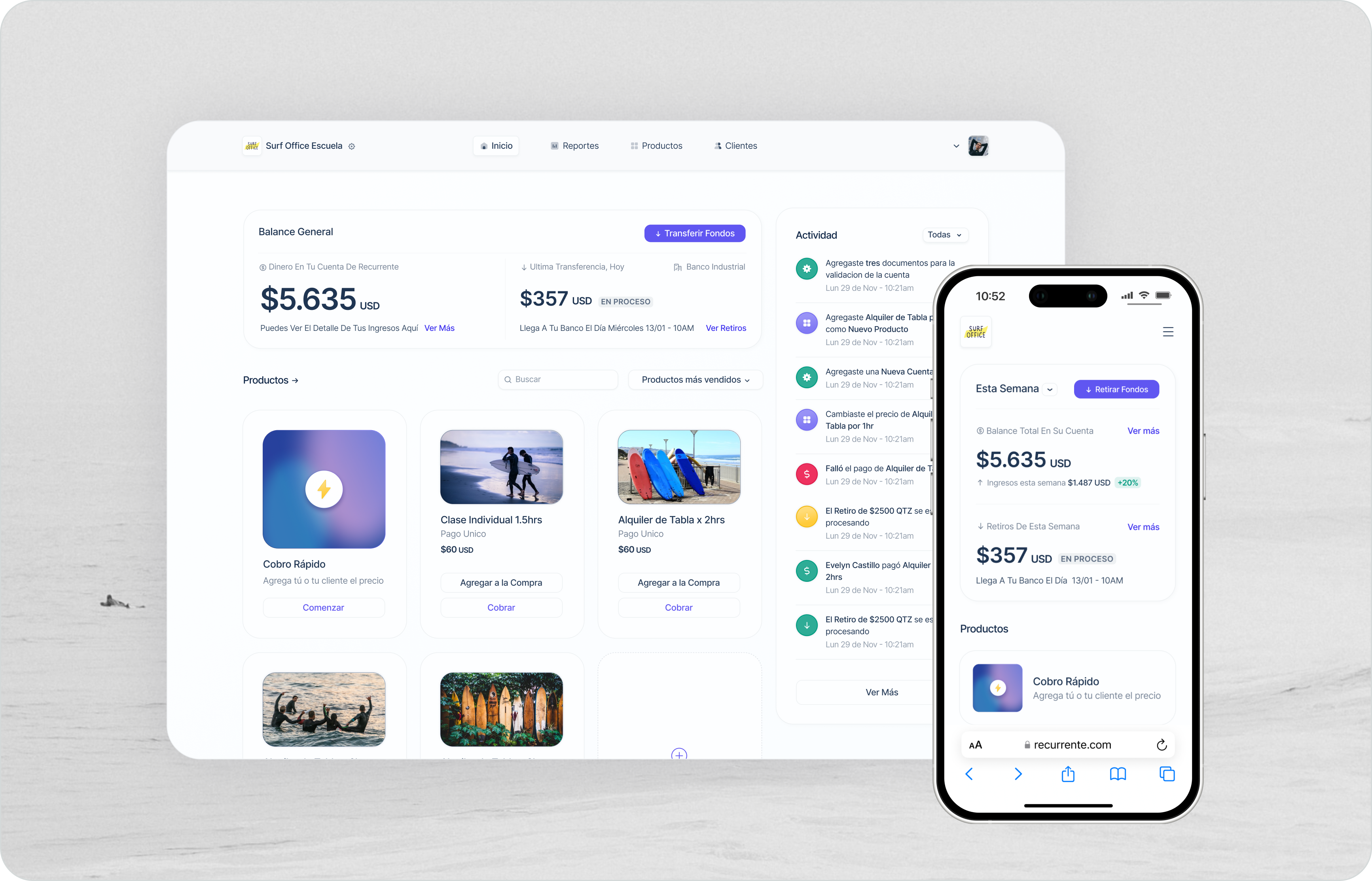
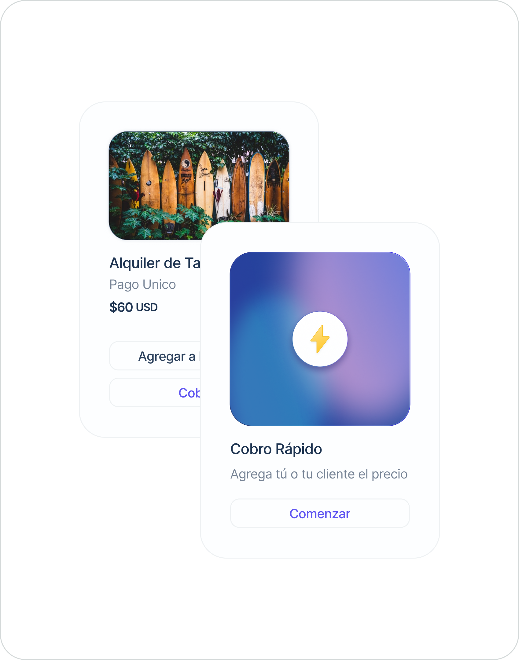
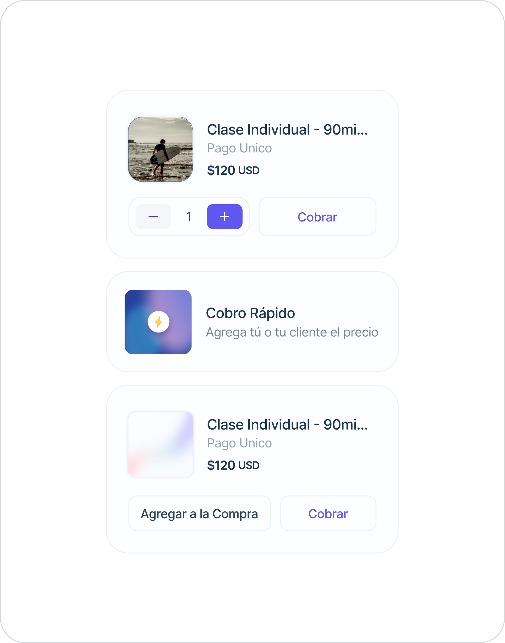
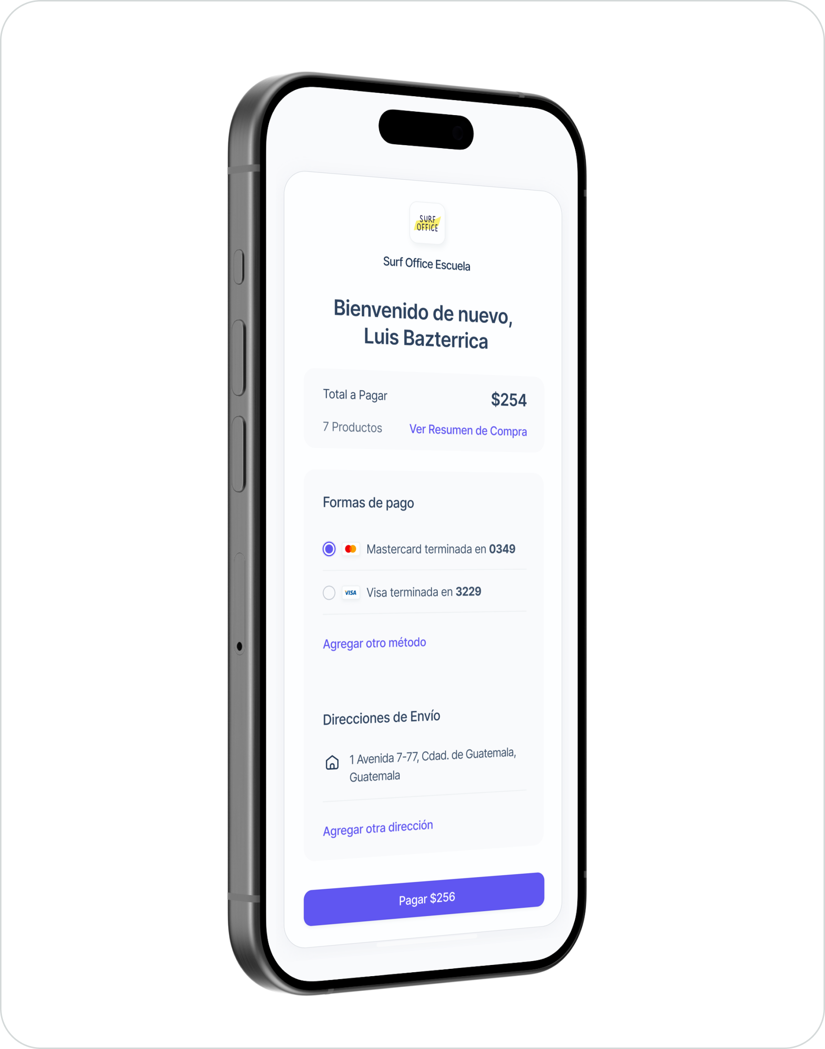
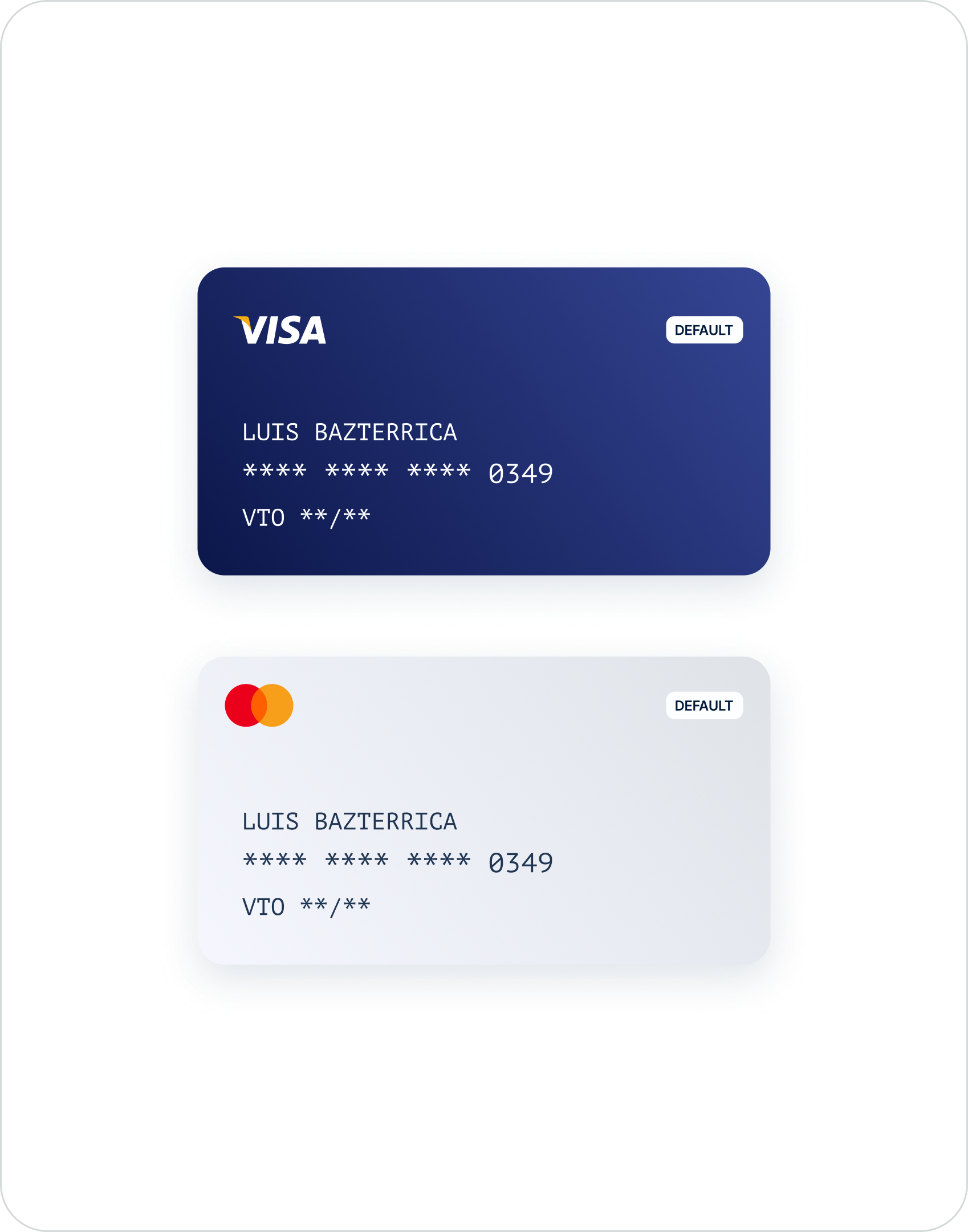
VISUAL STYLE
Another challenge we encountered with the platform was the need for a visually refreshing update. Since our user base ranges from young internet influencers to local shops, we wanted a design that struck the perfect balance - youthful yet professional, vibrant yet reliable. We aimed to create a fresh look that incorporated a hint of corporate appeal. To achieve this, we began by carefully selecting a new typeface for our product and exploring a brand-new color palette.
Let's create something unique Together
I WOULD LOVE TO HEAR ABOUT YOU, THE PROJECT YOU HAVE IN MIND, AND YOUR VISION BEHIND IT. LET'S CHAT.
NOT AVAILABLE FOR FREELANCE PROJECTS